CS601 – Tools for Website Design – MS Visio

A few classes back, Prof Sheehan mentioned using Miscrosoft Visio to help with website design and layout. (Keep in mind, by design I mean architectural design and not visual design.) As part of the BU Metropolitan College’s MSDN license, we have access to Visio. I downloaded it and gave it a shot to see what it offered. It does offer templates for design a seems useful.
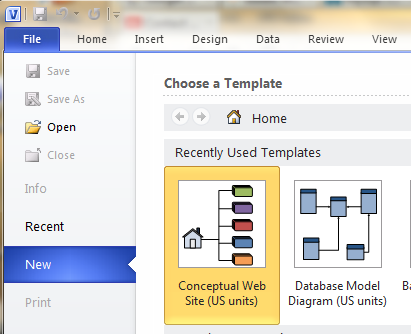
Using this template gives you access to a number of shapes for website pages:
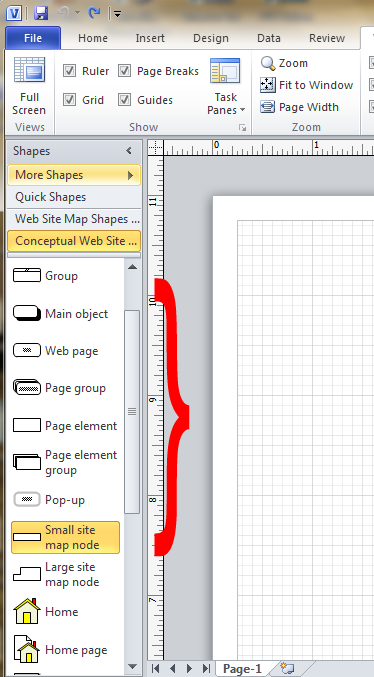
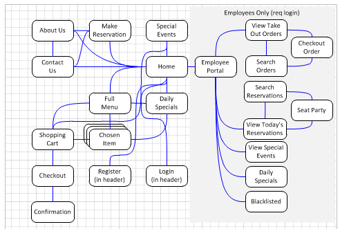
In building my site design, I used the Web Page and Page Group. There are also the map nodes, which I didn’t explore, but which might be useful for a larger sit In addition to simple shapes, the big advantage to something like Visio is using connectors to show how pages will interact and make you think about how someone might travel through your website. There is another panel (Web Site Shapes) which has more detailed shapes and other items that may be useful. (I didn’t use any of these as I was looking for a high level overview.)

And how does it look when all together?
For actual page layout, I have been using Powerpoint. This has proved useful thinking about what goes on each page and how users will interact with the page.

The other major part of this project is design of the underlying MySQL database. I explored doing this with Visio as it has a database design module. However, I couldn’t get the MySQL specific datatypes imported. Instead, I came across and started using MySQL Workbench, but I’ll talk more about this later.

First Real CS 601 Post – Felke-Morris Chapter 1 Focus on Web Design

First Real Post

The first blog assignment for class is to look at one of the sites referenced in the first chapter of Felke-Morris’ Basics of Web Design: HTML5 and CSS3 (LINK) and answer some questions about it. I decided to use the Creative Commons website. As an serious amateur photographer with (I’d link to think) above average knowledge of copyright issues, the idea of having a series of licenses that allows for sharing media without full release into the public domain. It also allows for more control than something like the GNU public license. (If you’re interested in this, I would suggest reading Siva Vaidhyanathan’s Copyrights & Copywrongs, though it may getting outdated as it was published in 2001.)

Anyway, to the topic at hand (web design). I’ll go through the questions as presented in the book:

  1. What is the purpose of the site? The main purpose of the site is to educate people about the concept of Creative Commons and the organization. (They also provide a mechanism to search for content.)
  2. Who is the intended audience? Basically everybody, but the focus in on media producers & users. However, this includes several groups such as artists, in one form or another, educators, scientists, and governments.
  3. Do you think that the site reaches its intended audience? Yes. The front page has links basic information presented prominently. It also has direct links on the main page to subpages for specific groups.
  4. Is the site useful to you? Yes. I actually have licensed my photos use CC license, and the site has provided detailed information on the different type of licenses. It also has a good description of the overall purpose of CC and why it’s important.
  5. List one interesting fact or issue that this site addresses. That both Al Jezeera and Nine Inch Nails have issued material under a CC license. This is actually important in that it shows it’s not just amateurs that are using CC licenses. Instead, real media creators are doing so as well.
  6. Would you encourage others to visit this site? Definitely. Issues of media ownership and use are very important to the future of information exchange.
  7. How could this site be improved? Personally, I find the very large summit "e;ad"e; distracting and takes away from the content. (On my smallish laptop screen, it cause the real information to be pushed off the bottom.)