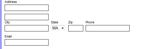
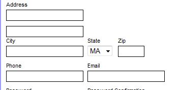
One of the issues that came up was where cases where divs floated (left, but I suppose it could happen to right floated ones as well) is that they are misaligned when they don’t fill the space. Below is an example of this from my registration form. What I want is to get fields in the form:
City     State   Zip

Phone     Email
Instead I get:

I fixed this to get the desired result:

How did I do this? I used a “clearing” div as follows:
        <label for="zipcode"><span>Zip</span>
            <input type="text" name="zipcode" />
        </label>
        <div class="clearing"></div>  <=== Relevant Code
        <label for="phone"><span>Phone</span>
            <input type="text" name="phone" />
        </label>
        <label for="email"><span>Email</span>
            <input type="text" name="email" />
        </label>
(Note, I omitted the City and State as the State select input has a bunch of irrelevant PHP code.)
An here's the CSS:
.clearing {
    clear: both;
}
Based on some quick reading, this is telling the browser to not allow floating elements on both sides, hence resetting the floats. I have to admit, I didn't realize this now. Instead, I have been using it extensively for float issues in the BU WordPress installation used for the Chemistry website. (It works even better now that they're not lost when someone edits a page with the visual editor instead of the HTML editor.)
Based on some additional reading, it seems like another way to do this is to put the objects in a containing div and then setting the width and overflow: auto . (See http://www.quirksmode.org/css/clearing.html.) I actually think the "old" way is better as you don't have to readjust the width of the container if the inner elements change and you don't have to have the extra CSS to set the width for each and every container. (Instead, I have one CSS selector for div.clearing.) Also, In my mind it's cleaner to have the single, self-contained div line in the HTML instead of the div wrapping a bunch of other code.
